BendSoap D2C Redesign
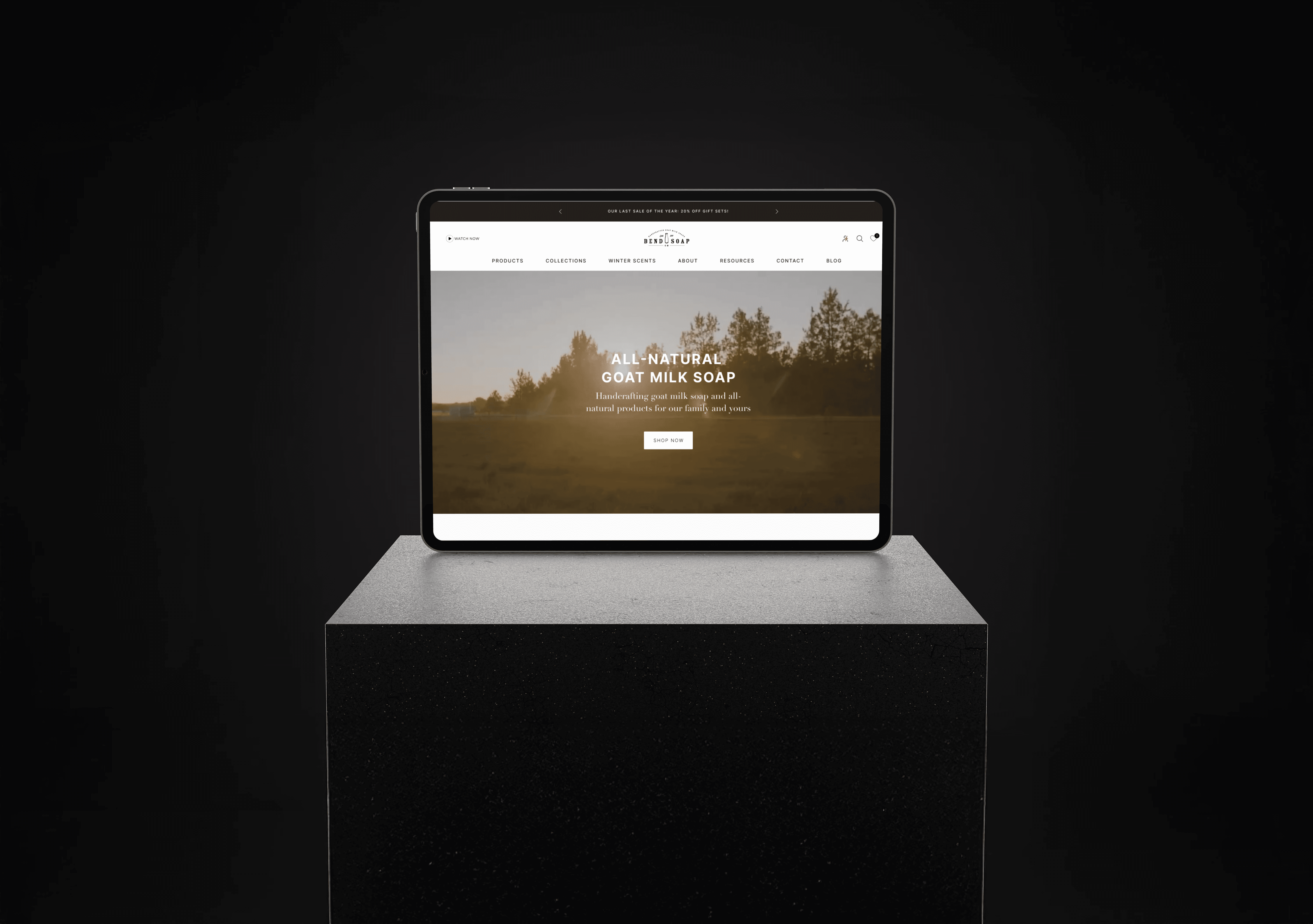
BendSoap required a complete D2C website redesign to streamline the online shopping experience and better reflect the brand's natural, artisanal identity. I led the UX research, wireframing, and UI design — creating a clean, trust-first digital storefront that drives conversions and communicates ingredient transparency.
Client:
BendSoap
Date:
Type:
Website Design
Role:
UI/UX Designer
Overview
The product was good. The website wasn't. High bounce rates, a 6-step checkout only 51% of people finished, and product pages that gave you a name and a price nothing more. In natural personal care, trust drives purchase. Ingredients, certifications, brand story. None of that was coming through. That's what I set out to fix.
My Role
Client: BendSoap
Type: D2C E-commerce Website
Role: UI/UX Designer (End-to-End)
Duration: 6 weeks
Tools: Figma, Shopify
Research
Audited 6 competitor brands. Interviewed 20 existing customers. What they kept saying: show ingredients upfront, make certifications visible, and cut the steps to checkout. Average clicks to purchase was 5. That alone told me where to start.
Design Process
Brand audit → defined a visual system around earthy tones, natural textures, clean type. Premium but not cold.
Site architecture → restructured to 6 pages. Added a "Shop by Concern" nav filter (dry skin, sensitive skin, fragrance-free) — users didn't know which product matched their need. This solved it instantly.
Product pages → redesigned around 4 trust pillars: ingredient transparency panel, certifications row, usage guide, UGC photo strip.
Checkout → cut from 6 steps to 3. Inline validation. Persistent order summary. That's where the numbers moved most.
Results
+34% add-to-cart rate — first 60 days
74% checkout completion (was 51%)
+1.8 min average session duration
Bounce rate dropped from 62% → 38%
Reflection
Tight timeline meant fast calls. The "Shop by Concern" filter came from a single interview it ended up being the most-used nav element. Sometimes you back your instincts and move.


