DreamTravel AI
An AI-powered travel booking platform where you just type what you need hotels, flights, full itineraries and it figures out the rest.
Client:
DreamTravel AI
Date:
Type:
AI Product Design
Role:
AI Product Designer
The Problem Worth Solving
Travel search hasn't changed in 20 years. You still open four tabs, use three filters, compare prices manually, and stitch together an itinerary yourself. The tools are powerful but the experience assumes you know exactly what you want before you start.
Most travellers don't. They have a mood, a budget, and a rough idea. The existing tools punish that.
DreamTravel is built on one design principle: the search bar should understand you, not the other way around.
Project Details:
Type: AI Product - Web (Responsive)
Role: AI Product Designer + Builder
Status: In Progress - launching soon
Tools: Base44 AI, Claude, Comet Browser, Figma AI, Unsplash AI
APIs: Gemini, OpenAI, Flight API, Hotel Booking API, Weather API
Who I'm Designing For
Before writing a single line of code, I mapped two user types that shaped every design decision:
The Spontaneous Traveller — Has a budget and a weekend. Doesn't have a destination. Gets overwhelmed by choice and abandons traditional booking tools after 10 minutes.
The Planner — Knows where they're going but spends hours across multiple tools stitching flights, hotels, and activities into a coherent itinerary. Hates doing the same mental work twice.
Both users share one failure point: the gap between "I want to travel" and "I have a plan." DreamTravel is designed to close that gap with one input.
Key UX Decisions and Why I Made Them
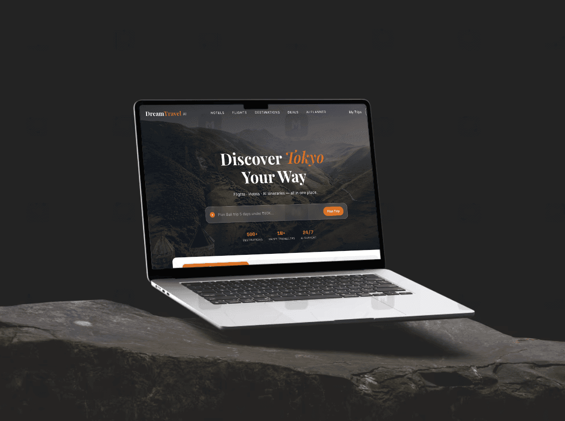
1. One search bar as the entire homepage
The first version of the homepage had a destination picker, date range, traveller count, and a budget slider — standard travel UI. I scrapped it after testing it on three friends. Every one of them asked "can I just type what I want?"
The revised design leads with a single conversational input. No filters until after results appear. The constraint forced better AI prompting on the backend and a much cleaner first impression.
2. Results before refinement
Most booking platforms show filters before results — you tell the system what you want, then it searches. I inverted this. DreamTravel shows results immediately, then offers smart filters based on what it found. This came from watching how people use Google: they search first, refine second. Forcing refinement upfront creates friction before any value is delivered.
3. The itinerary as a single shareable document
Early versions gave the AI-generated itinerary as a day-by-day list. It worked functionally but felt like an internal tool output, not something a traveller would actually use or share. I redesigned it as a styled travel document — with weather context, local tips, and a clean visual hierarchy — that a user would want to screenshot and send to a friend. Shareability is a growth loop, not just a nice-to-have.
4. What I deliberately left out
No social feed, no "top picks by influencers," no gamification. Every major travel app is cluttered with these. The design constraint I set for myself: if a feature doesn't directly serve the core query → result → book flow, it doesn't ship in v1.
What It Does:
AI Search: Type any travel query in plain language. Get direct results, not a list of links to click through.
Hotel Booking: Browse, compare, and book hotels. Results are pulled from live APIs so pricing and availability are always real.
Flight Booking: Search and book flights with real-time data. Built to handle one-way, return, and multi-city.
AI Trip Planner: Tell it where you're going and when. It generates a full itinerary places to visit, food to try, hidden spots, day-by-day schedule, and live weather for your travel dates.
Popular & Trending Destinations: Curated sections to help users who don't have a destination yet, just a mood to travel.
Trip Planning Guide: For first-time travellers or anyone who doesn't know where to start.
What Broke and What I Fixed
Building with AI tools means moving fast and breaking things publicly. Three things failed and taught me more than what worked:
The flight search initially returned results in a raw API format — price as a number, dates as strings, no visual hierarchy. Users couldn't scan it. I rebuilt the results card with clear departure/arrival blocks, a visual price comparison bar, and a single primary action. Scan time dropped significantly.
The AI planner initially gave generic itineraries ("visit the Eiffel Tower, it's a famous landmark"). The prompt engineering took four iterations to get specificity — local restaurants, off-peak timing tips, neighbourhood context. The UX lesson: when AI output is weak, the solution is upstream in the prompt, not in how you display the result.
The mobile layout for the search results was my biggest mistake. I designed desktop-first and retrofitted mobile. The results cards broke on small screens because I'd used a grid that assumed width. Re-doing this mobile-first cost me a full week.
Current Status and What's Next
Live and functional. Core flows — AI search, hotel booking, flight search, and itinerary generation — are working. Currently testing real booking completions and gathering feedback from early users.
Next: refining the AI planner output quality, adding saved trips, and building the guest checkout flow to reduce drop-off at the payment step.


